AMERICAN GYMNASTICS
Design Research | UX/UI
Overview American Gymnastics (formerly known as USA Gymnastics) provides up-to-date information about competitions, meetings, awards, and more. This website tracks the performances of elite-level gymnasts and spotlights exemplary accomplishments.
Challenges A cluttered homepage, redundancy of some information, the use of too many logos and links, and an abundance of sub-menus make navigation incredibly difficult.
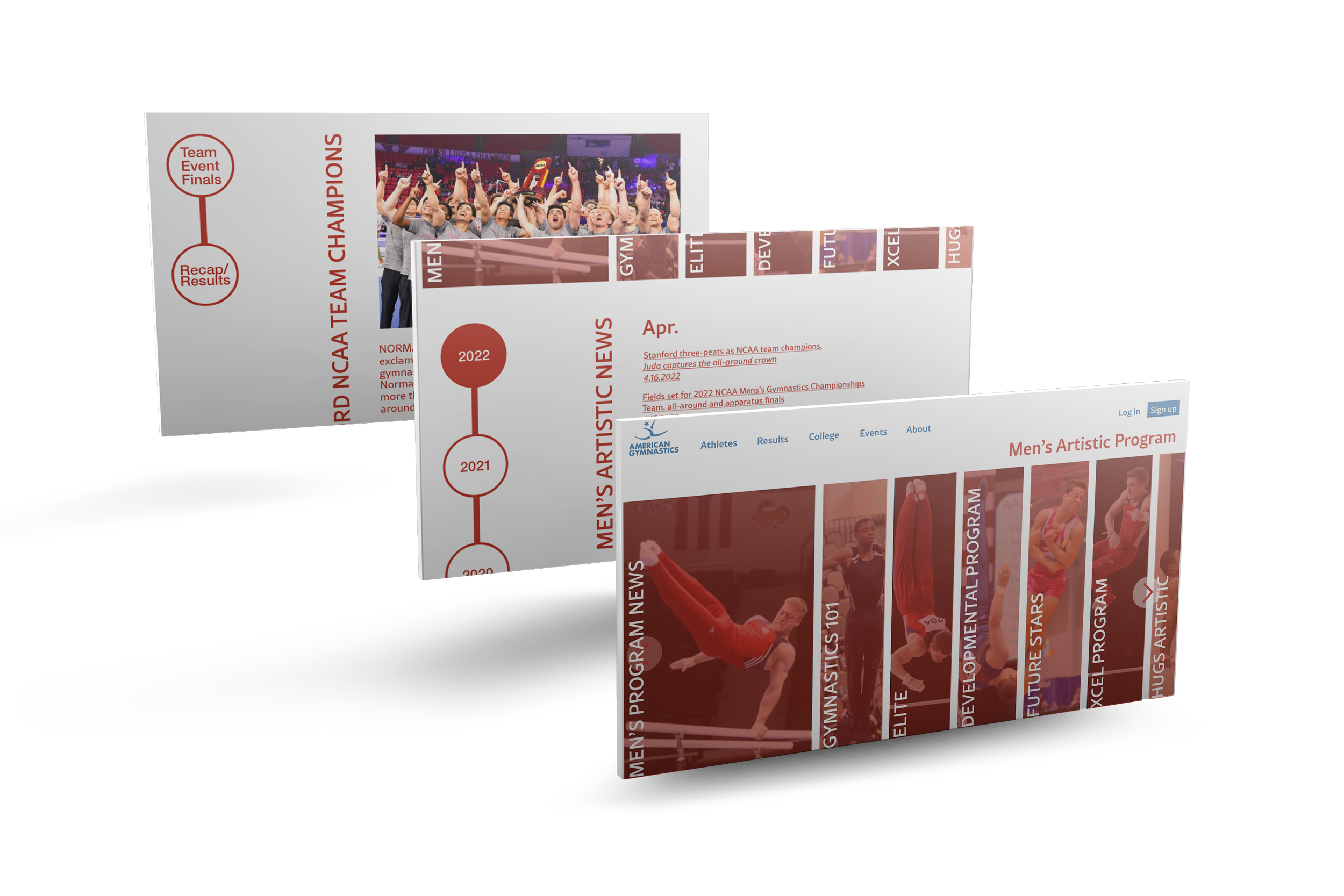
Approach User navigation was improved by adding visual elements that serve as portals for information previously presented through an over-abundance of links on the homepage; by reducing the color palette to two primary colors to create more white space and a cleaner presentation; and by combining redundant links to reduce the overall number of entry points where information is conveyed.
Introduction.
As a former competing gymnast, I remember looking at where my next competition would be located, what day it would be held, and figuring out who my competition may be. The website is fairly easy to navigate when you are only looking at 3 different tabs. As I started researching, it quickly came to my attention that this was a very complicated website and with the knowledge I have today, it can be much better.
Interviews
I had the opportunity to interview a gymnast who retired from her career as a level 10. She spent four years competing at this level and trained for the junior olympics as well as for a gymnastics career in college. With her experience I was able to gather information on how the site was used as an advantage and usability of the site site was for her. From this, I learned that the site can be, and is, very useful for not only those whom may want to learn more about the sport for themselves or their children, but also how gymnasts and their coaches use the site to their advantage.

How Might We Questions
With the information I received from the interview, I was able to take that information and come up with goal based questions that points out a few usability issues that could be resolved in the new design.

User Persona & Empathy Map
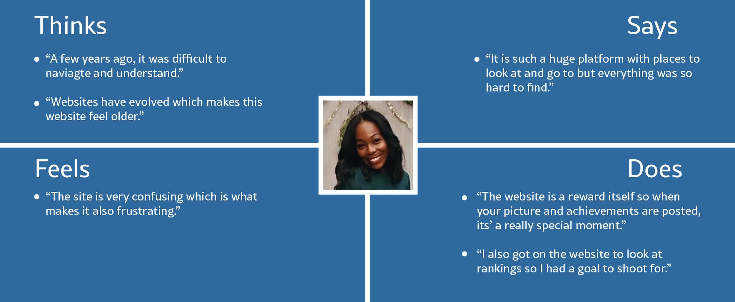
A user persona and empathy map were created with information provided by the interview. This is a visual to representation of who would most likely be using the site and how can we see this site being important from their perspective. This is also useful in understanding how important some features that are already used in the site and how some features could be added to enhance the experience.


Paper Prototype
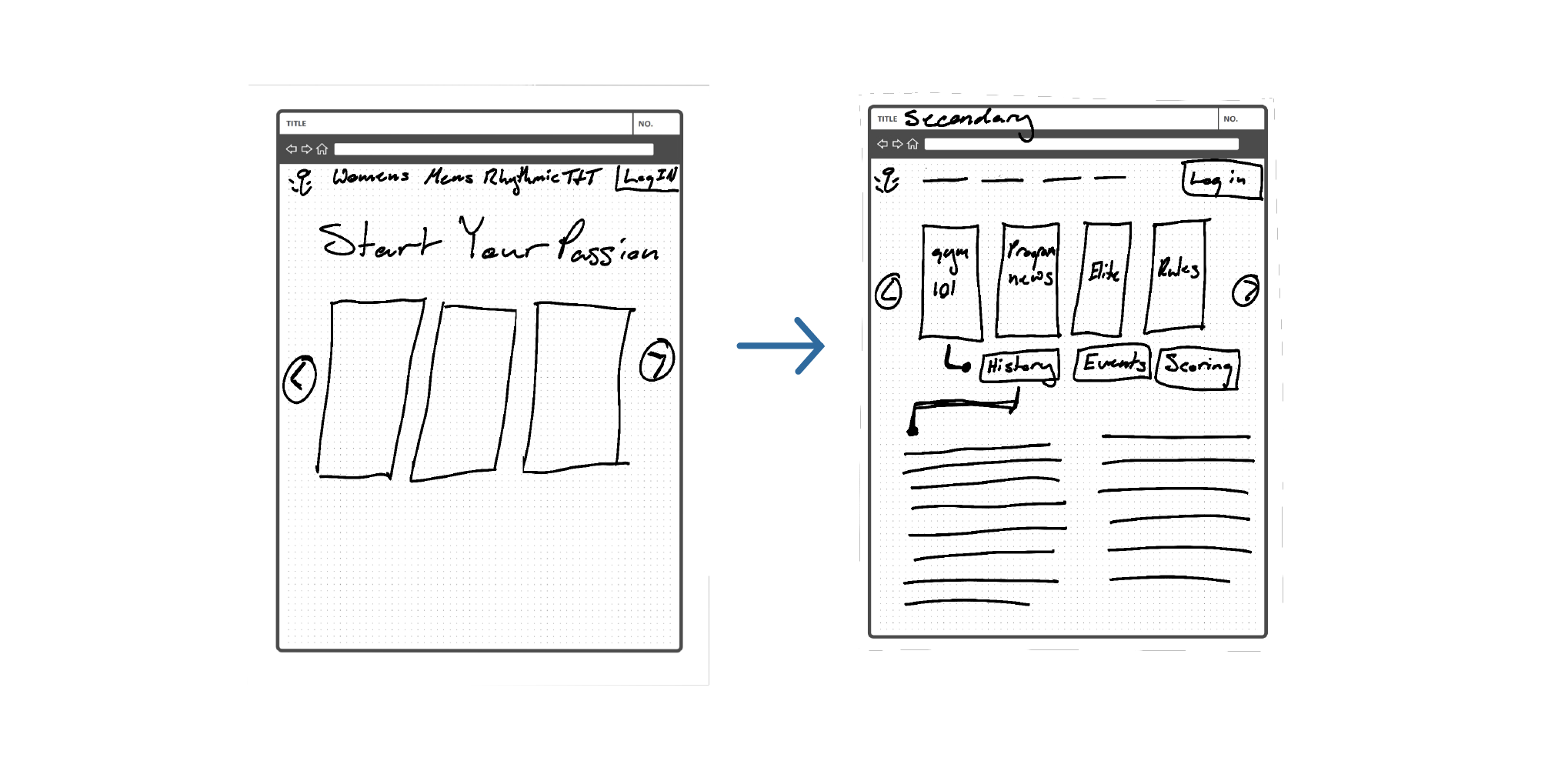
Low fidelity prototype allowed me to visually see how the flow of the web would work as well make any necessary improvements for the final product.

USA Gymnastics
First initial thought about the USA Gymnastics website is confusion. I was confused because the aesthetics of the site did not match the voice of the organization and what they stand for. USA Gymnastics is a huge organization that picks and chooses who will go to the Olympics every four years as well as keep up with collegiate and those who are level 10 elite gymnasts.
A lot of my research went towards studying the layout and navigation of this site. I felt that there was much to be improved on and started writing down exactly what was contributing to the uneasiness and frustration that users may feel when getting on the website to find information about competitions, programs within the gymnastics community, educational opportunities the organization provides, as well as results of gymnasts at competitions.
American Gymnastics
After researching USA Gymnastics, I realized it was necessary to come up with a solution for the navigation, organization as well as a little bit of their branding. I started out by creating a new trademark that represents a gymnast, then changed their name from USA Gymnastics to American Gymnastics. This new name embodies the people of the United States instead of the nation as a unit.
Next, I tackled the primary navigation at the top and broke it up into sections based on importance, and narrative. What I mean by narrative is that they all have something in common with each other.
Lastly, I decided that the secondary sub-pages were still very important to the user in because of the information it holds. So I came up with a system that was much more visually and aesthetically appealing for the user. The layout that I came up with eliminates feelings of anxiety and and frustration while also keeping all important information.


